A magic marker, a camera and some snappy editing combine to brilliant effect in this clever promo for Field Music‘s “In Context” directed by Dan Lowe. This is a great example of how pure creativity can cut through the bullshit and achieve over two million YouTube views.
Picked up at the always excellent Make: Blog...
Thursday 11 December 2008
Magic marker makes magic music vid
Thursday 6 November 2008
MGMT “The Youth” directed by Eric Wareheim
There’s a lot of talk in the music video world at the minute about how low budgets are making it difficult to produce innovative promos. I can’t imagine this piece of madness for MGMT's “The Youth” cost much to make, and it certainly helps them stand out from their contemporaries.
Thursday 23 October 2008
AC/DC’s ‘Rock N Roll Train’ – the world’s first music video in Excel format
We just finished this rather unorthodox project to promote “Black Ice”, the latest album from giants of rock AC/DC. The idea came about because we realised that many people work in offices where there’s a fairly heavy internet usage restrictions in place, and we loved the thought that we could subvert those policies with AC/DC’s music.
We decided to use the Excel format as it’s almost universally allowed through corporate firewalls. The result is the world’s first (and probably only ever) music video in Excel format, which plays back as ASCII art directly in the fields of the spreadsheet. You can download the spreadsheet here and try it out yourself.
Tuesday 14 October 2008
Make a poster from your Last.fm history with LastGraph
Andrew Godwin’s LastGraph is a clever tool which allows you to produce information graphics from your last.fm data.
The service’s coolest feature allows you to create a PDF (or SVG) poster of your listening history between two dates. Here’s mine from August 08 to today:
See a larger version
The fancy visualisation technique for the posters originally came from Lee Byron’s “What have I been listening to?” project.
The site also offers some premium features which allow you to hotlink graphs for inclusion in your own website (as well as helping out the project) for only £5 (or $10) a year.
Saturday 11 October 2008
The iPhone Blooms with Eno’s generative music
Upon checking out the app store this morning, I was pleasantly surprised to find Brian Eno and Peter Chilvers’ “Bloom” for the iPhone and iPod Touch. Simple and beautifully executed, the application allows you to create your own ambient music via a simple and intuitive touch interface. You can also run the app in “listen” mode and watch it generate the soundscape for you. Perfect for falling asleep to.
This app succeeds in three ways – simplicity, immediacy and beauty. You don’t have to know anything about music to achieve instantly great results. Your gran could understand the interface intuitively, and because it’s Brian Eno the music is beautiful and the aesthetic minimal. Ten out of ten.
Thursday 9 October 2008
Tumbltape turns a Tumblelog into a mixtape

Tumbltape is a brilliantly simple service which takes a Tumblelog and turns it into a playlist. For those of you wondering what the hell a Tumblelog is, it’s a type of blog which consists of short messages, pictures, music and video rather than the lengthier posts found on your traditional blog.
The combination works particularly well with my friend Laura KP’s blog, as she posts a lot of music. Check out the result here. I love it when things like this just work as if by magic.
Wednesday 8 October 2008
Music is Math
This music video by fellow Irishman Glenn Marshall is generated entirely from code using the marvelous Processing language developed at MIT specifically for use in programmatic art. The video looks amazing, although I am very slightly disturbed by the small swimming objects in evidence throughout the piece...
Monday 29 September 2008
Throwing up glitter
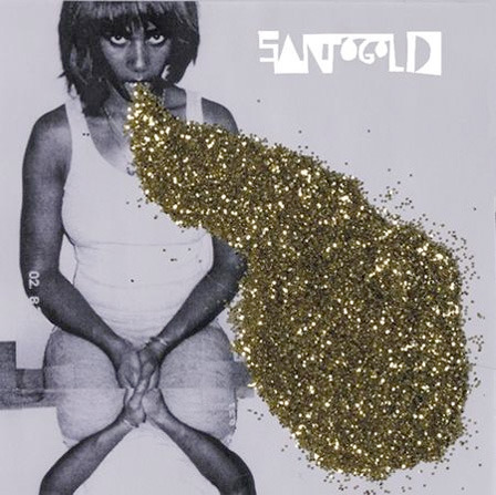
Great cover for Santogold by Isabelle Lumpkin. I can’t find any info about Isabelle online – if anyone knows who she is please let me know in the comments as I'd be interested in checking out some more of her work.
Tuesday 23 September 2008
Andrio Abero
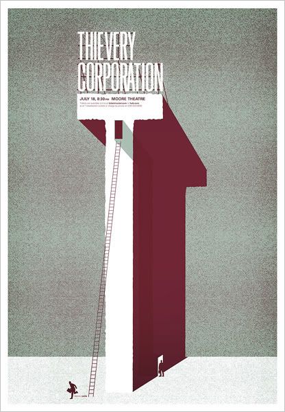
Great poster for Thievery Corporation by Andrio Abero.
Wednesday 17 September 2008
Sit on your favourite tune

Matther Plummer–Fernandez’s Sound/Chair began life as a sound, before being plotted on a three dimensional graph. The resulting shape was then crafted into a chair made from water–jet cut polyethylene. The result is a truly unique piece of furniture which any music lover must surely covet.
It’s on sale for the bargain price of £3950 at Designersblock’s temporary shop in Selfridges London for the duration of the London Design Festival.
You’ll need to get to the shop quickly, however, as I’m heading down there in my cat burglar outfit (complete with suction cups and grappling hooks) tonight to steal it.
Via DJ Chroma’s Tumblr.
Thursday 11 September 2008
More cowbell!
It's been a little while since a music related online service has come along which has made me drop everything and rush to try it out and find out more. MoreCowbell.dj is that thing. The service is a spin off of US tv show Saturday Night Live, where a special show featured Will Ferrell as Gene Frenkle, the cowbell player, and Christopher Walken as the music producer, Bruce Dickenson. It's simple but sure-to-be-massive mechanic allows users to add a variable amount of cowbell (and optional Walken) to any track they upload. They can then embed the newly modified track as a widget in their blog, social network profile etc. Here's one I made earlier:
The really exciting thing about MoreCowbell.dj is not the service itself, but the set of APIs that it's been built on. The Echonest provide a range of APIs which enable developers to build their own digital music applications without the need for expensive servers loaded with clever custom music software. Developers can use the service to analyse tracks and return important information like beats per minute and time signature which will undoubtedly lead to a whole raft of new browser based music apps.
Monday 8 September 2008
The laptop is a real instrument – official
DJ Chroma posted this article by Sasha Frere-Jones in The New Yorker about live bands using laptops on stage, which made me think.
When I’m not colouring in or sticking bits of the internet together with gaffer tape, I also like DJing. I remember the day I finally got my own Technics 1200s and a bad-ass Ecler scratch mixer. I practised very hard at first, then gradually a bit less hard. Then one day I realised that I had no new records because I had become so busy doing grown–up daytime stuff that I had no time to go to tiny crowded record shops and stand in line to use one of three available turntables to skip through the noisy bits of a bunch of 12s I often knew nothing about.
So I started using a laptop. I gave up scratching, juggling and the like (which I was only OK at after years of practice) and concentrated on playing music that people actually liked to dance to. I found that most of the labels I like sell downloads directly from their sites, and this meant that the night before I had to go out and play I could spend a couple of hours panic buying tunes from the comfort of my sofa.
Now I’m DJing more than ever (which was never very much to be fair) and people are actually dancing. My mixes aren’t always perfect, but no-one seems to care except me. And it’s all thanks to the laptop. My 1200s still look cool in my flat and occasionally I fire them up, but mostly they’re just really expensive conversation pieces. Come to think of it that 12" laptop is still pretty bulky. Can I justify spending £400 on a Tonium Pacemaker?
The Phonogra–
phantasmascope (or how to animate with a Technics turnable)
I’ve been staring at my 1200s for years and never thought of doing this. Bah! Found at the always excellent Monster Munch
Tuesday 2 September 2008
It’s the end
of The End
I just found out from my friend Richard Hewitt than London’s legendary venue The End is due to close it’s doors in January after 13 years of top-notch dance floor action.
I've got a personal attachment to the club as I've spent many late nights over the last five years making interactive flyers for my long standing client Sancho Panza’s regular night at the venue’s AKA bar. I’ve also spent many late nights / early mornings in the club itself.
Looking back over the flyers in a misty-eyed sort of way, my favourites are:
The big long street that took a whole year to make
The one with the lighter
The one with the stop motion electronic man
The one which loads random 70s photos from Flickr that I made while on my holidays in Bermuda
The one where the users helped to brighten up London
The one where you could play along with the music on a drum
I'll miss The End & AKA dearly but it’s not the last of my work for Sancho Panza. We’re currently working hard on a brand new website which will be launching later this year.
Should we be treating digital music like radio, not records?
For the first half of the twentieth century, commercial radio in the US was essentially illegal, and stations were subjected to the same kind of copyright lawsuits that P2P users are experiencing today. It was only after songwriters banded together to form The American Society of Composers, Authors and Publishers (ASCAP) that radio stations went legit. In return for a fee the radio stations gained the right to play whatever music they liked.
The Electronic Frontier Foundation has an idea called Voluntary Collective Licensing which would apply a similar logic to digital music. The idea is that the music industry forms several “collecting societies” which offer file-sharing music fans the opportunity to “get legit” in exchange for a reasonable regular payment (something like $5 - $10 a month). The money collected would be divided among rights-holders based on the popularity of their music.
I think this is a good idea. It differs from a subscription model in that it allows users to choose the service that they want to use, and it also allows for user generated music libraries such as the ill-fated Oink to operate legally. The license fee could easily be rolled into consumer products such as broadband internet or mobile data packages (unlimited digital music sharing for an extra £5 a month!), and P2P users already do a much better job of publishing, cataloguing and documenting music than the music industry themselves.
You can read the full article over at Electronic Frontier Foundation where they have neatly set out their case and attempted to provide answers to many of the inevitable questions that arise.
Monday 4 August 2008
“Okay, I get it. You’re creative. Awesome.”
“But you’re totally wasting my morning as I helplessly wait for your designer’s dancing sausages to finish loading.”
Excellent post on 43folders.com entitled “Five Mistakes Band & Label sites make”.
On a side note, apologies for the lack of posting action on Sleevelessness in the last couple of weeks. I'm going through what is undoubtedly the busiest period of my career to date. Normal service will resume in September once I get back from my well deserved holiday. In the meantime I'll try to post the occasional thing to keep all you fabulous people interested.
Wednesday 16 July 2008
The world is flat...

...in this retro-eighties-high-tech-but-somehow-still-charming poster for Jose Gonzales by Nate Duval. The US gig posters scene just keeps giving and giving – if only promoters in the UK cared about design in this way.
You can buy it for the giveaway price of $25 in Nate’s shop where he’s also got tons of other great posters and art prints for sale.
Cable reunion poster by Aaron Horkey

Aaron Horkey of Burlesque Design, Minnesota has created this amazingly detailed poster for American hardcore punk band Cable’s reunion tour. It also has the distinction of being the longest image I’ve ever posted. Spotted at OMG Posters.
Wednesday 9 July 2008
LP Cover Lovers unearth car boot sale treasures
Matt and Tony are two guys based in New York who've spent the last 30 years collecting vinyl LPs and 45s with funny, quirky and unusual covers. Now they've decided to share their collection with the world at the LP Cover Lover blog.
Here are just some of the many gems they’ve revealed so far:
Soul Snaps drum breaks have been sampled by Ol’ Dirty Bastard and The Prodigy.
Health and safety was a big thing in the fifties
It meant something different in those days apparently...
The world’s first album cover
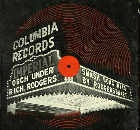
This, apparently is the world’s first album cover, designed for Columbia by then 23 year old designer Alex Steinweiss. Before this records were sold in generic sleeves. You can read the full story and see lots more images over at Udependent.
Friday 27 June 2008
Setting stuff on fire is cool – official (an interview with Andrew Strasser)

Earlier this month many of the music blogs were talking about how mashup master Girl Talk (Gregg Gillis) planned to release his latest album “Feed The Animals” in a Radiohead “pay what you like” style. I checked out the website and immediately thought, “feck the business model – this record’s got a great sleeve!”. I emailed GT’s record label Illegal Art to find out who was responsible, and they kindly put me in touch with Brooklyn, NY based designer Andrew Strasser who agreed to conduct a swift email interview for Sleevelessness.
Slv Great sleeve for Girl Talk’s “Feed The Animals”. What’s the story behind the cover?
A.S. Behind every cover there is a story, haha... There are two parts to Feed The Animals – the title, and the image that we ended up with. I do stage visuals when Girl Talk goes on large tours or plays at big festivals, and all of the equipment was seriously just getting eaten up by all of the comotion on stage. We had large inflatable palm trees and halloween spider archways, all from very suburban on-line inflatable stores. As soon as the inflatables would go up, the chanting impatient crowd would just get a hold of it somehow, and we’d just watch a palm tree get sucked right into the organic mass of Girl Talk fans... never to be seen again. When you go on a 30 day tour, and watch this happen every day, you start feeling like you are going on some kind of an expedition to feed the hungriest of animals (we’re animals too for going along with it).
The cover itself does not relate to “Feed the Animals”. I was doing visuals with Gregg in Las Vegas when he opened for Gnarls Barkley, Kanye West, Lupe Fiasco, and others for this very exciting and very strange Chinese New Year celebration. The crowd was SEATED, and was mostly a hip hop crowd, very mainstream. There was an MC and of course, he’s going to pick on the sorest thumb of the show, which would be Girl Talk... He kicks it off with “so why are you called Girl Talk anyway, what kind of a name is that?”... I think that he was kind of scarred from having to answer that question in front of so many skeptics. The solution was to do a subtle name change from Girl Talk to GT - not an official name change, just a nickname. Gregg originally wanted the GT flames on a brick wall, but I suggested a more ET/Home Alone kind of image, something that references the suburbs more.
Slv Where is the house? Did you take the photo yourself?
A.S. I was in Virginia Beach visiting my family, and I grabbed my moms 6 megapixel snapshot camera and did some long exposures on the house across the street when they had only one light on, and that became the house. Somehow the shot came out perfect.
Slv Did you really set the grass on fire?
A.S. We were really aiming to set a big lawn on fire and actually do it, but the logistics were absolutely bo-bo, so we didn’t do that. I did a micro scale version of the GT on fire with some twigs and lighter fluid, with help from my lovely sister Dana, and our great friend Lisa Ramsey (who was originally going to be a silhouette in the lit window of the house). We preferred nobody in the shot eventually.
The twigs overlaid on the grass was a good first start, but it didn’t look LARGE it made the house look like a scaled down model. I then turned to fire rendering techniques from some really tacky and cheesy websites where they teach you Photoshop tricks, like how to write your name out in fire, or in gold. I took this knowledge and went really far with it - I embellished the flame with some real shots of fire from our barbecue grill from memorial day (my dad was squirting tons of lighter fluid into our backyard grill).
Slv When did you first realise you wanted to be a designer?
A.S. I don’t want to be a designer. I want to be a musician. I am working on my own album right now.
Slv How did you get your first break? (e.g. the first piece of design work that you actually gave a shit about)
A.S. I started in middle school, someone punched me in the stomach for wearing a Mossimo shirt in the halls and I was so infuriated that I couldn’t wear a shirt, that I started researching ringer t-shirts (very skater style at the time). I took a picture of the tide bottle with a 1 megapixel camera (that was a lot at the time) and went over the words TIDE in paintbrush to make it say ZINE. then i did the same with a Chinese takeout box.
I made about 30 shirts and sold them all to the hottest girls in my middle school through a top secret mole in my math class. He had the in.
Slv How did you first get involved with Greg Gillis (AKA Girl Talk)?
A.S. He used to see me around in the cafeteria in college and vice versa – he looked like Rivers Cuomo and I looked like some big fat nerd who tucked his shirt in and wore a tie every day (this has greatly changed, now both of us have beards and we wear ugly clothes all the time like a bunch of hippies).
We eventually hung out once with our friends Mike Ray (who is redoing the Illegal Art website and brand with me) and Alex Preston (who is now in the band Mittens on Strings and makes incredible hand made shirts). I remember that night begging for them not to shave a Ninja Turtle face in my hair (they gave me a haircut the first time i met them and we hung out).
Slv Where do you work and what are you working on this week?
A.S. I work at home, in front of Google Spreadsheets, managing my clients. This week I’m working on my album, and doing some promotional flyers and banners for a Big Gay Cruise in Fire Island – should be fun! I also attended an event on Monday night for my friend Jeremy Parker’s record release party (Tha Pumpsta), I wore my costume (Turns out Andrew is also a performance artist - check out Bad Brilliance for more info).
Slv What records are you listening to right now?
A.S. Lil Wayne + Feed The Animals is the heavy duo right now.
Slv You wake up in Brooklyn, you’ve had 1,000,000 beers last night and a magic badger offers you any item of food you like – what would it be?
A.S. Nachos with cheese, ground beef, strips of beef, burger meat, cow beefs, pork, pork beefs, raw chicken, dutch chicken, deep fried halved radishes soaked in duck fat, sour cream, guacamole, blue cheese dressing, crab meat lumps, cheddar cheese, nacho cheese and drizzled with lime and tequila and flame torched for like 3 seconds or so.
You can check out lots more of Andrew’s work at his website including some excelllent photography.
Strasser also did the above cover for White Williams’ “Smoke” – you can check out the intriguing story behind it at Paper Thin Walls.
Wednesday 25 June 2008
Best use of flipbook, ever.
Super video for “Squeeze Me” from the brilliantly named Dutch act Kraak & Smaak. Found at Swiss Miss.
Friday 20 June 2008
Adrian Shaughnessy interviews Storm Thorgerson on Resonance FM today
My good friend John Foley of bite! informs me that Adrian Shaughnessy is interviewing legendary graphic designer Storm Thorgerson on Resonance FM today. Storm is most famous for his album covers for Pink Floyd such as the iconic sleeve for Dark Side of the Moon (below). You can listen online at 4pm (GMT) today.
Two design graduates to watch
Last night I went to Dialogue, the LCC (London College of Communications) Graphic and Media Design degree show. The work of two graduates particularly caught my eye.
Look What You’ve Got, is described by designers Shaz Madani and Billy Woods as “a celebration of everyday objects we have falled out of love with”. The project featured a collection of household items which had seen better days, and a series of beautifully made posters encouraging the viewer to take a second look at these items in a new light. Unlike many of the show’s exhibits the project was accompanied by a helpful booklet allowing outsiders such as myself with no knowledge of the brief to understand what was actually going on.
I also saw some excellent typographic posters by Niccy Kemp. Unfortunately Niccy’s site is all Flash so I can’t deep link to the posters (or extract a decent image to post here), so you’ll have to visit her site and click on My Work > Monsoon Trust to check out the goods.
Tuesday 17 June 2008
A Number of Small Things equals one greater thing
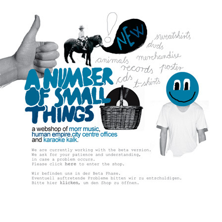
Berlin based Morr Music have always had great art direction. Now in an interesting creative collaboration, they’ve launched an online shop with two other small German labels, Karaoke Kalk and City Centre Offices. At A Number of Small Things you can shop for all three labels’ releases alongside Human Empire’s clothing, bags and posters. This is a great example of how like minded labels and creative types can club together to create a better shopping destination for their online fans. The site is currently in beta and they aren’t yet selling music downloads, but I’ll be watching how it develops with interest.
Typodiscography
The Ministry of Type spotted this great Zune ad in Wired magazine and kindly scanned the pages for all of us to see. Nice use of typography. Original article here.
Wednesday 11 June 2008
Keith Richards hawks posh luggage, result is entertainment
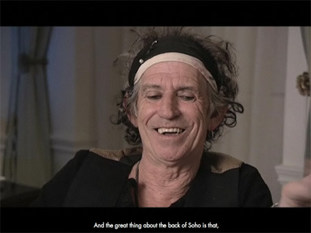
Keith Richards is a legend. He may be less than coherent as a result of years of “recreation” but what he says is still pretty interesting to anyone into music and rock ’n’ roll culture. Louis Vuitton have realised this and included a piece about him in their “Journeys” project, a series of travel themed films and photo essays featuring icons such as Richards, Mikhail Gorbechev and Catherine Deneuve.
The piece is a good watch with film-maker Annie Lebowitz making the most of her less than “focussed” interviewee through good edits and handycam style footage of Richards’ London. The real reason I’m talking about this here, though, is that this is a great example of branded content. Many of the musicians in our industry are interesting people with great tales to tell. With physical music sales declining and digital yet to catch up, artists are having to look at other ways to make money. Brands like Louis Vuitton benefit immeasurably from “aligning” themselves with characters such as Keith Richards. Pieces like this don’t tend to ram the brand down the user’s throat but instead focus on the content, so the deal’s not too bad for the punter either. I reckon we can expect to see more of this type of brand “enabled” music content in the future.
Ward off evil spirits while listening to your favourite tunes
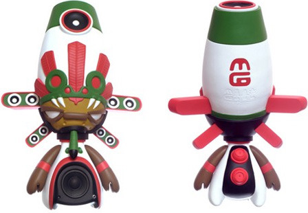
Here’s something a bit different – MiniGods speakers combine a vinyl toy aesthetic with a functioning pair of desktop speakers. They’re currently available in “Brazil” and “Mexico” (pictured above) incarnations with a “Japan” version coming soon. Dvice has a review and more pics.
Sunday 1 June 2008
Magne–Disque est magnifique!

At a time when music packaging is on a downward spiral, French electro / folk / pop act ALB have generated a surprising amount of publicity for themselves on the back of the outrageously extravagant (and unashamedly retro) packaging for their debut album Magne-Disque. The album even comes with a mini-cover for each song. Catch the full low-down and lots more pics at Sleeveage.
Weezer rolls ’em all into one
If you haven't seen this by now you’ve obviously discovered the Lost City Of Atlantis, snapped up a bargain two bed flat and are still waiting for the underwater telco to hook up your broadband.
I’m posting it anyway because it’s brilliant. The ten years of internet “memes” featured in this three and a bit minute vid, such as Daft Hands, Chocolate Rain, Diet Coke & Mentos etc. represent a notoriously difficult thing to harness for the purposes of marketing. The brilliant thing about this video is that it does just that, and ruins it for everyone else in the process. The very fact that the video’s director (Mathew Cullen of Motion Theory) managed to get all these crazies to take part is a herculean feat in itself. Nearly 5 million views in a week says it all – hats off and wish I’d thought of it myself.
Saturday 31 May 2008
Further down the rabbit hole
Pogo (Nick Bertke) has made an EP of tracks which are 90% constructed from samples of Disney’s Alice In Wonderland. Check the video above – this really is remix culture at it's most brilliant.
Discovered at BySoAndSo
Wood is good
Great cover for this Lindstrom and Prinz Thomas 12" on Eskimo Recordings.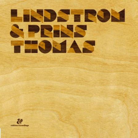
Originally spotted at Iso50.
Thursday 29 May 2008
A little bit of New York in London
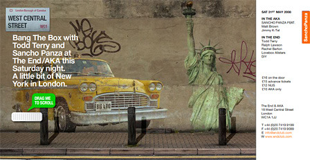
It’s time once again for my monthly e-flyer for Sancho Panza at The End / AKA club London. No fancy interactivity this month unfortunately as I’ve been away sailing in Scotland for the last week or so and only had one evening to conceive and execute the thing. Thankfully there’s now a two month break in the schedule which will allow me to address lobbing Sancho’s seven year old Flash site in the bin and replacing it with something shiny and new.
Monday 19 May 2008
Jeff Brooks
I'm loving the US indie poster scene at the moment. Venues commission their own posters from graphic artists who show little respect for artists’ branding and instead create beautiful and unique works of art, often in limited, hand-printed runs. Jeff Brooks is the creator of these marvelously simple and fun posters.
There’s lots more posters in Jeff’s gallery at gigposters.com.
Tuesday 13 May 2008
Fabric’s posters back to their slightly unnerving best
The Creative Review Blog have a sneak preview of some of the excellent work that’s made it into the Magazine’s 2008 Annual.
I particularly liked these posters for London super-club Fabric, created by Village Green (can’t find a link for them unfortunately).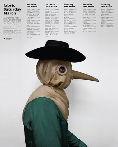
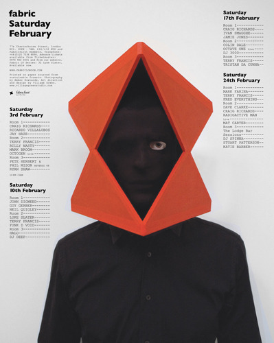
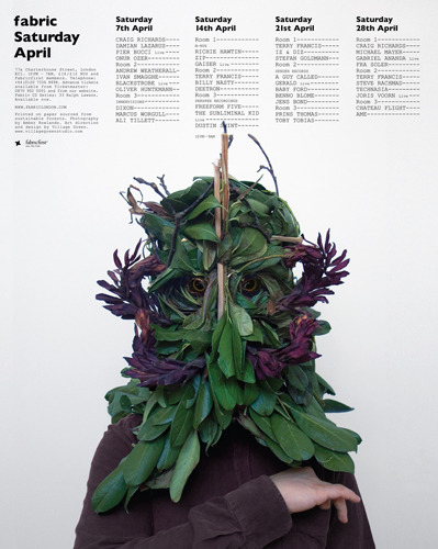
When Fabric first opened their posters and flyers were of a really high standard, and although the production values have remained consistently high, they never really achieved the heights of the collages created by Love in the club’s early days. Great then to see the club’s design work back to it’s slightly disturbing best with these unusually sinister characters created by Village Green’s Tom Darracott.
Wednesday 7 May 2008
Say it after me “PEHDTSCKJMBA”
Tom Waits puts his phenomenal bullshitting skills to work, promoting his latest tour with this hilarious fake press conference. This is a great example of clever, cost effective online promotion. The artist’s popularity and personality combine to create a piece of content which is more effective than anything most marketing types would typically create. For more info and a full list of dates, check out the original article at Wired Listening Post.
Tuesday 6 May 2008
Printing with records
This poster for Spoon by Texas based F2-Design is printed with actual 45rpm records, making each one unique.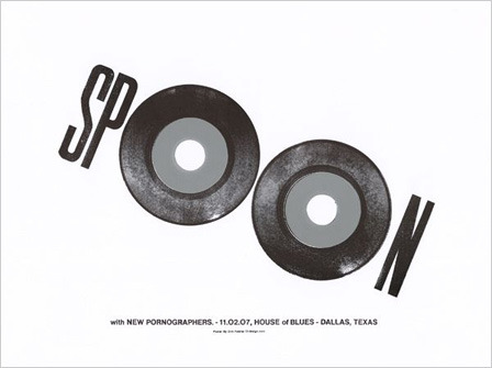
I'm also loving this one for New York Dolls in Chicago: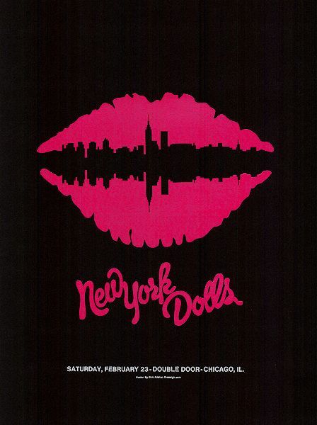
There’s loads more great posters at the F2-Design site, and if you’re quick you can snap up some of the remaining limited editions.
Sunday 4 May 2008
The Small Stakes
Sounds like a band, but The Small Stakes is in fact the name of Jason Munn’s Oakland California based independent design studio. Jason turns out a mean poster, as evidenced by his work below for bands like Broken Social Scene and The Postal Service.
There are loads more fantastic posters for sale in The Small Stakes shop.
Friday 2 May 2008
Big things in the sky
I know it’s nearly summer when it’s once again it’s time to create an e-flyer for my favourite client Sancho Panza’s yearly series of boat parties. This year I decided to do something a little bit different so instead of creating the usual interactive extravaganza, I made a poster.
It's accompanied by a simple e-flyer where punters are offered a free PDF they can print themselves. They also have the option to order a high-quality print from zazzle.com. Zazzle is a print on demand service based in the US which allows you to configure your poster with a number of options including paper stock and print size. Unfortunately there’s no equivalent to this service in the UK right now so if you want one and you're not in the US you’ll have to grapple with the not-too-difficult task of paying with a credit card in US Dollars.
Thursday 1 May 2008
No pussyfooting
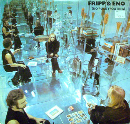
Scott Hansen turned up this quirky cover for Robert Fripp & Brian Eno’s excellently titled 1973 release, “No Pussyfooting” (a reference to the quick and spontaneous way the record was created). The music involved passing Robert Fripp’s electric guitar through an analogue tape loop developed by Eno, resulting in a deeply layered piece of what would later become known as ambient music. The visual concept of infinitely repeating mirrors perfectly illustrates the qualities of the music in a simple and striking way – design and art direction at it’s purest.
Monday 28 April 2008
Death Cab For Cutie
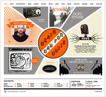
Nice website for Seattle band Death Cab For Cutie who also have the best band name, ever. A nice balance of Flash, typography, good design and layout, minus 10 points for the silly splash page. We did the 90s already remember? Site by Mathematics.
Thursday 24 April 2008
Add a little colour to your weekend

Here’s this month’s e-flyer for my long-standing client Sancho Panza’s monthly night at The End & AKA club in London. Users can add a splash of colour to the city via some rather exotic feathered fauna.
Monday 14 April 2008
Sparks will fly

Tonight’s random surfing turned up this excellent poster for Philadelphia based band Audible by Philadelphia based illustrator extraordinaire Tim Gough. You can see lots more of his posters at GigPosters.com. 
Tim also produces Cut and Paste, a beautiful hand-crafted zine he describes as “a collection of abandoned ideas, random doodles, and half finished leftovers” – you can order a copy from his shop.
Saturday 12 April 2008
Bands have logos? Band ID reviewed and my top 10 logos from the book
My copy of Band ID arrived during the week and today I finally had a chance to take some pics of the book. First impressions are that it's good quality – it's reassuringly weighty and the hard cover is sturdy and nicely textured. The pick image on the front is slightly raised and plasticated which is a nice touch, although ironically the logo for the book itself is a bit half-assed. The internal spreads are well laid out with plenty of white space and well set type.

The logos are divided up into different genres of music (the extra-heavy section is a particularly good laugh) and the stories behind several of the more iconic logos are well told, including interviews with the designers and musicians involved. I particularly enjoyed reading the back-story to the creation of the Rolling Stones iconic “tongue” logo, contributed by the marque’s designer John Pasche. The book is mostly devoted to the logos themselves, but where there is writing it’s insightful and entertaining.
Rather than bore you all to tears with an in-depth review, I've decided instead to list my ten favourite logos from the book. I've chosen the logos I think represent good examples of logo design rather than those representing bands whose music I like, or about whom I feel a misty-eyed nostalgia. This means I consider them well drawn or typeset, memorable and having stood the test of time.
1. Rolling Stones “Tongue”

Designed by John Pasche in 1970, the tongue has become one of the most recognisable symbols in the world. At heart it's simple, memorable and nicely drawn.
2. Slayer

Steve Craig’s spiky yet minimal lettering is in my opinion the best of the heavy-metal marques. It was created in 1983 and still looks fresh today.
3. AC/DC

Gerard Huerta’s 1983 logo for AC/DC has graced a million maths books, school bags and t-shirts across the globe. It's compact, direct and has loads of balls, just like the band it represents.
4. Emerson, Lake & Palmer

Swiss surrealist artist H.R. Giger’s 1973 marque for ELP is elegant, graceful and wouldn't look out of place in Bauhaus era Germany.
5. Metallica

Designed by band member James Hetfield in 1983, this one rivals AC/DC as the ultimate metal logo.
6. Kiss

Created by the band’s lead guitarist and former graphic designer Ace Frehley in 1973, the Kiss logo courted controversy on the German legs of their tours with it's SS inspired aesthetic. It's the perfect corporate logo for Gene Simmons' money-making rock machine.
7. Thin Lizzy

Jim Fitzpatrick’s chunky 1976 creation for Thin Lizzy is everything a no-nonsense rock band’s logo should be.
8. New York Dolls

The coolest of the bunch, the Dolls’ distinctive lipstick lettering was created in 1973, yet looks like it could have been made yesterday.
9. The Monkees

The Monkees weren’t even a proper band, but they definitely had a proper logo, a slice of beautifully crafted lettering designed by Nick LoBianco in 1966.
10. Run DMC

Bold and shouty, the chunky type and heavy horizontal rules of the Run DMC logo do justice to the hip-hop legends’ explosive sound.
Attempting to find links to information about the creators of these ten logos threw up a few interesting bits of trivia:
The ELP logo was designed not by a graphic designer, but by the Swiss surrealist artist H.R. Giger, who is also the creator of the Alien creature from Ridley Scott’s pant-soilingly scary sci-fi film of the same name.
The Monkees logo was designed by legend of lunch box (yes those things that kids take to school with flask, apple and very thin ham sandwich in) design Nick LoBianco.
The Thin Lizzy marque was created by Jim Fitzpatrick a fellow Irishman whose lengthy artistic career completely bamboozles me. How can the same man who created the image of Che Guevara which became an icon of popular culture, have gone on to create some of the most ghastly pseudo-celtic crap ever to blight the world of art. These days he seems to spend his time photographing beautiful women and his latest work can be found at his Flickr stream.
Band ID, The ultimate book of band logos by Bodhi Oser is available from the publishers, Chronicle Books for the entirely reasonable price of $40. I picked mine up from Amazon UK where it was a steal at £13. This is one coffee table book which your friends will actually pick up and read, so if you love music and you were the type of kid who drew band logos on their schoolbag, then grab yourself a copy without delay.
Subscribe to:
Posts (Atom)
